A musical symbol of Szczecin
Szczecin Filharmonic Hall named Greatest Contemporary Architecture Piece in Europe! On 8 May it received the prestigious Mies van der Rohe Award 2015, often dubbed “the European architectonic Oscars”.
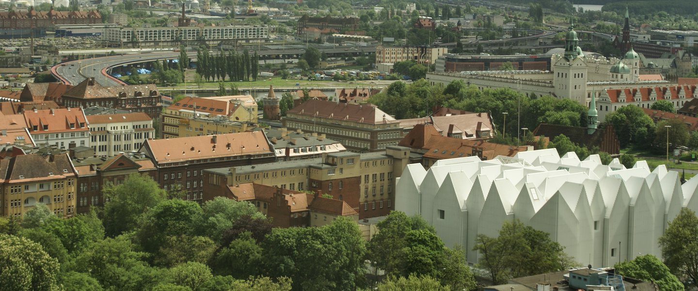
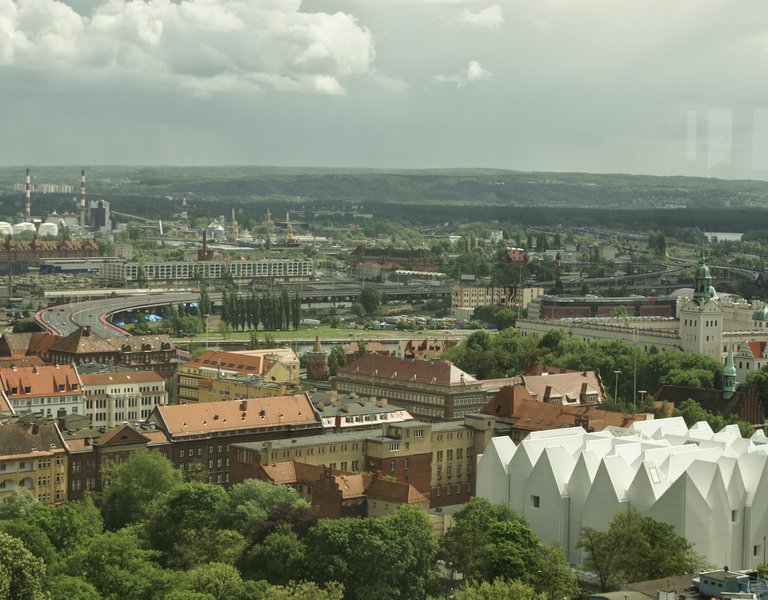
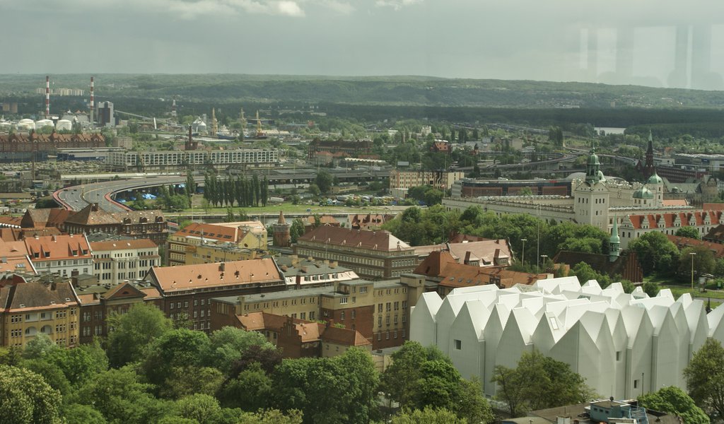
The soaring white “palace on ice,” to which members of the M. Karłowicz Philharmonic orchestra are just moving in, is one of the most awaited investments in Szczecin, proclaimed the city’s new symbol even before the construction began. The futuristic white block has been designed by Estudio Barozzi Veiga, a Spanish architectural studio which already has some experience in concert hall design. The firm defeated NOW, an architectural office from Lodz, which had presented a project inspired by Szczecin’s pre-war Konzerthaus. The runner-up’s design was the city inhabitants’ favourite. The only thing that today’s philharmonic and the old Konzerthaus have in common is the location at the corner of Matejki and Małopolska streets in the very heart of the city.
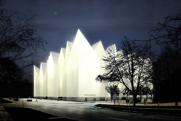 “The building combines two contradictory ideas: tradition and modernity,” Tomasz Malkowski and Marcin Szczelina, curators, architectural critics, and owners of Architecture Snob website, tell Polska.pl. According to them, tradition resides in the building’s shape, which looks like a historic frontage formed by high buildings that are characteristic for ports. “But this tribute to tradition has been given a very modern form. The building is a white monolith with no windows. The creators tried to make it look immaterial,” they add, and note that the façade is the building’s weakest point. “The glass LED-lighted walls with steel razor blade-like blinds were meant to create the illusion of frozen mist. But the final effect is quite heavy, and the building resembles a corrugated steel market stall. At night, it looks kitsch, like a circus or a night club. But it was an ambitious project, a great idea which simply failed to materialise,” say the critics.
However, Tomasz Malkowski and Marcin Szczelina praise the philharmonic’s interior design as one of the best in Polish public institutions. “We like this purity, geometry, spatial complexity, consistent space design and narrative building: the visitor enters the huge bright vestibule, climbs elegant stairs, and arrives at the culminating point - the golden concert hall,” explain the critics.
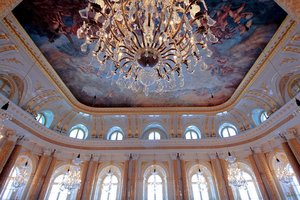
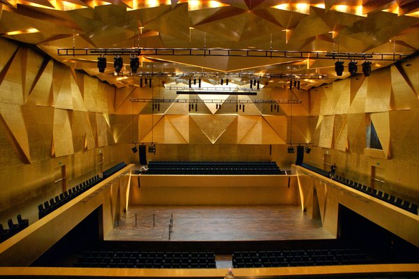 The philharmonic has been designed according to international standards. Its concert halls are even more spectacular than its glass façade illuminated with lamps which can be arranged in 20,000 different combinations. The hall of 951 seats for orchestral concerts is the fourth biggest concert hall in Poland and one of the most modern in terms of equipment and sound system. The ceiling hides sound curtains, while the black seats have been designed in such a way that they do not creak. Nothing can affect the pureness of sound.
An untrained eye will first of all notice the building’s sumptuousness - the philharmonic is covered with 3,000 gold-coloured tiles, laid by employees of an antique restoration firm. Dorota Serwa, the philharmonic’s director, says that the symphonic hall symbolises the Sun, while the smaller chamber-music hall of 192 seats symbolises the Moon. The latter hall is much more modest, and illuminated by small lamps that look like stars.
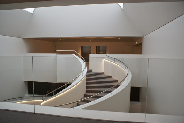 Members of the philharmonic’s orchestra, who used to play concerts in one of the wings of the city hall, cannot understand how they could do without this luxury. Apart from the great concert halls, they can also use soundproof rehearsal halls, as well as dressing rooms with lockers, washbasins, huge mirrors, and screens showing the stage.
The new concert hall’s inauguration lasted from 5 to 12 September 2014. Each day was dedicated to a different musical genre. Music lovers had an occasion to enjoy classical music, while amateurs of opera were able to see a concert by internationally renowned singers. Enthusiasts of jazz, dance shows and choral music also found something for themselves.
However, the philharmonic has changed not only its concert venue, but also its logo. The old logo with lyre has been replaced by the letters FS, which are said to be more modern and resemble a spreading sound wave. According to Ms Serwa, this logo is also easier to transform into 3-D forms, gadgets or statues. Atektura, a Szczecin design firm and the author of the logo, has opted for soaring letters in colours that correspond to those of the philharmonic’s concert halls.
KAROLINA KOWALSKA
08.05.2015
